

BLOG
Mobile Friendly/Responsive Website Design
Important Google Mobile-Friendly Update Coming

We at Limelight Online are huge proponents of responsive website design and never develop a website without making sure it is mobile friendly. We’ve always considered the user in our design process and with the huge uptake in the use of mobile devices over the past couple of years we know we need to future proof our client’s sites and ensure that they are giving their site visitors the best possible experience regardless of the device they are viewing the website from.
Mobile Design and its Increasing Importance

Back in November 2014, eMarketer published an article on Australia’s dominance over the US and UK in regards to higher search...
Why We're Using Bootstrap Now

Wondering if Bootstrap is the right front-end framework for you? We've been using Bootstrap for nearly a year now and I can say wholeheartedly that moving to Bootstrap was the right decision for us. I approached Bootstrap cautiously for a number of reasons, but we haven't regretted the decision to adopt Bootstrap for a second!
We're Using SVG for Website Builds. Should You Be Too?

We have recently begun using SVG images in our website builds. Read on to learn about why we've made this decision and how SVGs can improve usability and performance on responsive websites.
One Responsive Tool to Rule Them All

Building responsive websites is a fantastic way to have your website flow nicely on to any size and shape of device on the market. At the end of any development stage always comes testing though and testing on multiple devices can be quite time consuming. It only takes one small tweak on one device to mess it up on others. This post introduces a new tool developed specifically for the purpose of testing your responsive websites before rolling them out.
Using Divs for the layout of your site - more important than you think!

Desktops, Tablets, Smartphones - do you need to future proof your website for all three? Find out why you should be using divs over tables!
Responsive Web Design - The Geek Stuff

Wanting to know how to build your own Responsive Website? View these 3 easy steps to achieve a website that will look great on all devices.
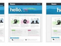
Responsive Design - is your website mobile device friendly?
It probably comes as no great surprise that mobile device usage is on the increase in New Zealand particularly with all...
The Rise of Smartphone Use in NZ - Is Your Business Ready?
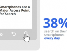
When the first commercially available mobile phone hit the markets in 1983 who would have imagined the technology they would be...
RECENT
POPULAR

- March 2024: Google algorithm update - A crackdown on low-quality AI generated content
- GA4 - Where to Start?
- Compulsory shift to Responsive Search Ads coming in June
- What are Google Ads keyword match types and how are they changing?
- How do I get my business to show up on Google? Part 3: Google Shopping Ads