

BLOG
One Responsive Tool to Rule Them All
Building responsive websites these days has its challenges but the results are always rewarding. There is nothing better than to see your full blown desktop site - that you've spent hours coding - shrink itself down to a streamlined greyhound on the latest gadget of your choice. Getting to this point though requires a number of bridges to be crossed - one of them is the developers bitter enemy... testing.
It's that phase we all love to hate.
That tedious, long drawn out, testing process
Testing always slows the process right down and points out all your flaws, and who wants that, really? But, once you get past it, you can see your polished site looking like the next best thing you post all over Facebook. Testing responsive websites is nothing new and comes with the territory. Ideally you will want to test on each device based on the traffic coming to your website. Doing this can be a tedious process - especially when you tweak something for your iPhone which then breaks something on your Android tablet and is further not supported on your Windows Phone.
So is there an easier way to streamline this initial process?
Absolutely!
Enter The LimeLight Responsive Website Tool
There are already a number of great responsive website tools out there and each has its own purpose and feature set. However, no one tool appeared to combine all the features into one nice user-friendly interface. So, over the past 3 weeks, we've set out to bring all the great ideas out there and combine them into one intuitive tool.
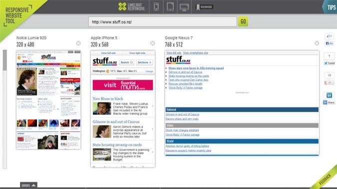
Our responsive website tool offers the following features and benefits:
- Display multiple devices side-by-side on the screen at the same time
- A single scroll bar to automatically scroll through all devices at the same time
- Auto detection of the meta viewport tag and zooming in/out as required
- Error reporting based on common setup mistakes with responsive sites
- Clicking on links will automatically update all devices currently being viewed to offer a true synchronized browsing experience
- A simple #hash tag URL is created to easily share via email or social media
- A bookmark that you can drag into your toolbar to quickly send any website you're currently viewing into the responsive tool
- The ability to switch into "minimal" mode for viewing sites on your local network that aren't visible over the Internet
Although no single tool can give you 100% the same effect as the actual device e.g. using our tool in Firefox will not emulate iPad font rendering and other such tweaks, it provides a great platform to get most things ironed out before doing device testing. It also lets you quickly review a CSS change on your desktop to see the flow on effect for your smaller devices.
We Value Your Feedback
It is great to be able to offer powerful tools back to the development community and I would encourage any new ideas and feedback of how to expand on this tool to mention them in the comments area below.
Click the image below to try the tool yourself. Happy testing!


Related posts


Add a comment4 Comments

- March 2024: Google algorithm update - A crackdown on low-quality AI generated content
- GA4 - Where to Start?
- Compulsory shift to Responsive Search Ads coming in June
- What are Google Ads keyword match types and how are they changing?
- How do I get my business to show up on Google? Part 3: Google Shopping Ads