

BLOG
Responsive Design - is your website mobile device friendly?
It probably comes as no great surprise that mobile device usage is on the increase in New Zealand particularly with all the great offers available now from the main telecoms companies.
Google conducted a survey earlier this year which has highlighted some interesting statistics about the increased use of smartphones by New Zealanders. Below is an example of some of these statistics:
- 46% saying they have used their smartphones every day in the past 7 days
- 59% access the Internet on their smartphones at least once a day
- 41% are using Search Engines such as Google to find sites that fit their needs
- 35% are expecting to use their smartphone more to access the Internet in the future
It is estimated that by 2015 access via mobile devices will surpass desktop computer usage when connecting to the Internet.
So looking at these statistics it makes sense that your website must offer users a great experience when being viewed on a mobile device. A great experience can help your business increase sales but a bad one is likely to drive customers to your competition. You need to engage them with a mobile experience designed for completing on-the-go tasks from their small screens.
Businesses that make mobile a central part of their strategy will benefit from the opportunity to better engage with the new consumer – those that are constantly using their phones to do business.
Responsive Design
The way to make your website mobile device friendly is via what is called Responsive Website Design (RWD). A website built using Responsive Design techniques will automatically resize for different devices be it on a desktop computer, a smartphone or a tablet. Responsive websites remove the need for scrolling to get to the information you are looking for which means that the whole user experience is improved. It is very important to make it simple for a smartphone user to view your content, make a booking, complete an enquiry form for example.
Responsive Design Examples
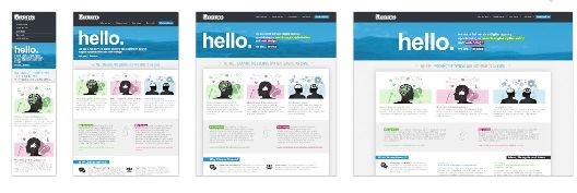
This site - http://mediaqueri.es/ has some good examples of the different layouts for each mobile device. This website itself has used Responsive Design so resize the page using your browser and see what happens.
Search Engines – what does Google say
Google have recently announced that they recommend websites follow the industry best practice of using Responsive Website Design. They recommend it because:
- Using a single URL (website address) for a piece of content makes it easier for users to interact with, share, and link to your content, plus a single URL helps Google to index your site
- No redirection is needed for users to get to the device-optimised view, thus reducing loading time
- Responsive Website Design saves resources for both your site and Google's crawlers as Google only needs to crawl your pages once to retrieve your content. This improvement in crawling efficiency can indirectly help Google index more of your website's content
Do I need a separate mobile website?
You may have been thinking that you need to have a separately designed website for mobile devices but with the advent of Responsive Website Design this is no longer necessarily the case.
However, it must be said that Responsive Website Design is not right for all websites and that having a separate mobile website may be the right way to go.
To help determine if a separate mobile site is necessary, you should research your user base by reviewing your site statistics and analytics. This will give you the information you need to decide if you can offer a different version of your desktop site, or if you need to create a custom experience tailored specially for your target market.
Essentially if users have significantly different goals when using your site on a mobile device then probably Response Website Design is not right for you.
So why Responsive Website Design? Here is an overview of some of the main advantages:
- Only one website to maintain that displays correctly across all devices
- Reduced development costs i.e. not developing two separate sites
- Only one website address. There is no need to update different versions of your website separately.
- Future proofing your website as new screen sizes evolve e.g. TV's that you can access the internet on.
- Users can get to your key calls to action/information quickly. This means higher conversion rates which in turn results in increased sales
- Search Engine friendly mobile solution – Google recommends Responsive Design as it provides an optimal user experience to smartphone users
If you know you need to something to change your website so that it is mobile friendly and don’t know where to start just give us a call.

Related posts


- March 2024: Google algorithm update - A crackdown on low-quality AI generated content
- GA4 - Where to Start?
- Compulsory shift to Responsive Search Ads coming in June
- What are Google Ads keyword match types and how are they changing?
- How do I get my business to show up on Google? Part 3: Google Shopping Ads