

BLOG
How To Make Your Website Form Engaging
Most websites will have at least one sign up form to encourage users to make an enquiry, make a booking, subscribe to a newsletter, become a member or to sign up to certain services.
It is not enough to make sure the forms work (although of course this is a must) and hope that they will be completed. The forms need to engage with the user and encourage them to sign up.
There are various ways in which this can be achieved.
- Correctly name the link to the sign up form. ‘Click Here’ isn’t really engaging enough. Try ‘Start Here’, ‘Subscribe’, ‘Register’, ‘Join’, ‘Book Now’, ‘Enquire Now’.

This form shows a clear link to the Enrolment form.
- Make sure that the link to the form is as visible and obvious as possible otherwise users to your site may miss it or spend too long trying to find the form and give up.
- When a user has clicked the link the expectation is that it will go straight to the form so don’t add any further navigation options. This will only confuse and distract.
- The form design must be simple and intuitive. Provide easy to understand instructions and a description as to what will happen when the form is completed.
- Make sure your form’s fields are labelled clearly. This can be easily achieved by making the labels bold.
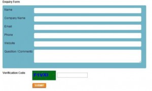
This is an example of a simple form with clearly labelled fields that are long enough to add in the required information.
- Don’t make the form too long or complicated. You can always ask for extra non-mandatory information after the form has been completed. Users like to do things quickly and this includes filling out forms.
- Make sure it is obvious which fields are compulsory and if text is going to be rejected then say why. For example, for a phone field say that there should be no spaces between numbers. It is better to mention this on the form than have it come up as an error message. Your user could be left thinking ‘Why didn’t they tell me when I was completing the form rather than after I have completed it’.
- Most users expect form fields to be vertically aligned as the eye travels naturally moves downwards on forms rather than across. If you have any horizontally aligned fields these may be missed.
- If you do need to have a long form then it is a good idea to use a progress indicator so users know how far they have to go before the form is completed.
- The form should be designed so it fits in with the overall look and feel of your site and not as if it has been added as an after thought.
If you have any additional form tips we would love to know.

Related posts


Add a comment2 Comments
Suzanne,
These tips are so practical. Sometimes, I shake my head in disbelief when I see the amount of information that someone wants to collect. The thing some people forget is that it's a potential customer who is filling out that form and the number one thing they're thinking is "What's in it for me?". If the form is confusing or takes too long to complete, it's very easy to go elsewhere.
A good way to tell if a form is being effective (or if people are bailing) is to take a look at your analytics for that page and see how many people are exiting. That can be a real wake-up call.
Thanks for a great post. I'll keep it in mind for the next time that I'm working with a client who is over-complicating things.
Thanks for your comments Sherryl. Yes, using Analytics is a great way to monitor the activity on each and every page of your website. Knowledge is certainly power and if you, as you say, you can see that people are leaving a page quickly then you know you need to do something about it.
RECENT
POPULAR

- March 2024: Google algorithm update - A crackdown on low-quality AI generated content
- GA4 - Where to Start?
- Compulsory shift to Responsive Search Ads coming in June
- What are Google Ads keyword match types and how are they changing?
- How do I get my business to show up on Google? Part 3: Google Shopping Ads