

BLOG
Using Divs for the layout of your site - more important than you think!

Divs vs Tables, it’s one of the great debates in the web development community. It’s been described as the debate that won’t die. Both sides have their advantages and disadvantages, but div-based layouts have a new ace up its sleeve, and that ace is called Responsive Web Design.
With the increase in the number of people using mobile devices and tablets to browse the internet, Responsive Web Design has become one of the new buzz words in the web development community.
I’m not going to go into too much detail, but basically Responsive Web Design is the process of designing a website using techniques that allow the layout of the website to automatically adapt to fit the device it is being viewed on.
With this in mind, using divs has clearly gained the upper hand over table based layouts. Divs allow you to use the flexibility that CSS offers to build a future proof responsive website, that allows you to have one website for desktop, tablet and mobile.
Let's see!
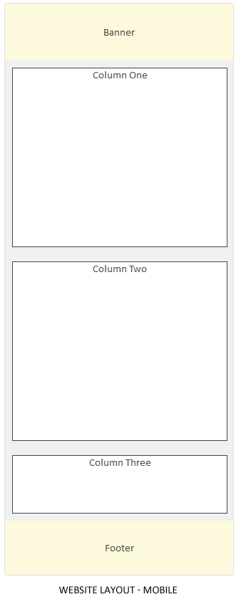
To demonstrate how easy it is to make a div based website responsive, I’m going to create a simple website layout using divs. In my CSS I’m going to add styles specific just for mobile devices. This means the layout of our website is going to appear differently on a mobile device compared to our standard desktop screen.

Creating the layout
Banner
Navigation
Column One
Column Two
Column Three
Footer
Styling the layout
As you can see just a few extra lines of CSS allows our website layout to display nicely on mobile devices.
Creating forms using Divs - just as important!
Ok great, so we have established that divs need to be used for the layout of our websites, but what about forms? Forms can be made responsive in the same way, using divs for the layout structure and applying our CSS.
Let's see!
To demonstrate how forms can be made responsive, I’ve created a simple contact us form using only divs.


Creating the form
Styling the form
What if my forms have already been created using tables!
There may be a situation where you need to make a current website responsive and the forms are already in tables.
Rather than re-creating all forms on the website to use divs, we can apply some CSS to our current tables to force them to behave how we want them to behave responsively (i.e. not to behave like a table).
To show you how this can be done, I’ve created our contact us form using a table.
Name:
*
Email:
*
Phone:
*
Comments:
*
* Required fields
Styling the table
I’ve applied the following CCS to style our table and to make it responsive. The important thing to note is having set width applied to our table and adding float left onto our TDs and THs.
Data tables can be made responsive too!
As I’ve demonstrated earlier, layouts can easily be made responsive through applying CSS, but what about data tables? Data tables offer a challenge as they don’t do so well with responsive designs. The problem with data tables is often the minimum width of the table is greater than the screen size available, and if we make the width of the table too small the table cell will start wrapping its content making it difficult to read.
The solution
To demonstrate how to make data tables responsive, I’ve created a standard data table and I’ve applied some CSS to best display the data on a mobile device.


Creating the table
Location
Holiday Park
Check In
Nights
Rate From
New Plymouth
Seaside Holiday Park
01/05/2013
1
$45.00
Opunake
Opunake Holiday Park
02/05/2013
1
$44.00
The CSS
There are a few important things to note in the CSS to make our data table display nicely on our mobile device.
First of all we need to hide table headers. Basically we cannot manipulate the table headers with CSS to appear how we want them to appear. To hide them change the position to absolute and set left to -9999px and top to -9999px (as shown in the CSS).
We then need to wrap each TD under each other so that they appear on its own line. To do this I give each TD a set width and apply float:left.
Finally we need to create our own table headers (labels) by using CSS generated content (:before).
I’ve given each TD a class name so that it’s easy to apply :before to each TD.
Conclusion
With the increased number of people using mobile devices and tablets to browse the internet and the introduction of Responsive Web Design to create one website that will display well on multiple devices, Divs have clearly gained the upper hand over table based layouts. Using divs allows us to apply CSS to make our layouts flow naturally when viewed on mobile devices.
Although it is possible to apply CSS to tables and make them responsive, it requires you to force tables to no longer behave like tables.
So, if you want to future proof your website, say no to table based layouts and use Divs for the layout of your websites and forms.

Related posts


- March 2024: Google algorithm update - A crackdown on low-quality AI generated content
- GA4 - Where to Start?
- Compulsory shift to Responsive Search Ads coming in June
- What are Google Ads keyword match types and how are they changing?
- How do I get my business to show up on Google? Part 3: Google Shopping Ads