

BLOG
Responsive Web Design - The Geek Stuff
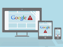
So with numbers rocketing of people using mobiles and tablets for internet browsing, it makes sence that you're website should look great and be user-friendly on all platforms, right? Solution? Responsive Design.
Here's the geek-guide on creating your very own responsive website.
What is Responsive Web Design?
Responsive Web Design is a website that responds to the device on which it is viewed and displays the appropriate layout and information accordingly.
This is achieved by assigning certain CSS styles based on which size-bracket our device's width falls under. Our actual HTML coding will remain the same at all times. For example – to show less content on your mobile version, you will need to 'hide' the element using 'display:none'.
So let's get started!
3 Steps to Achieve your Responsive Website
Step One: Setting our Viewport
Mobile browsers usually render pages wider than the screen to best layout websites. We use the below tag to set our width to the device size. The below tag also will set the zoom level of the page on first load (initial-scale). Other properties can include height, device-height, maximum-scale, minimum-scale and user-scalable.
Add the following meta tag to your HTML in thearea:
Step Two: Creating our CSS file
Your CSS file will be made up of:
1. Your Default styles for all devices.
2. Your styles for your desktop.
3. Your styles for your tablet (using the @media tag to set the minimum and maximum width - see recommended sizes here).
4. Your styles for your mobile device (also using the @media tag).
CSS EXAMPLE
/* CSS That applies to all versions */
#container {
margin:0 auto;
}
a {
color:red;
}
/*
Desktop CSS code.
We don’t put media tags around this code as it can cause problems in some browsers. Instead we have this above our mobile and tablet CSS, so that on these devices our desktop styles are overwritten.
*/
#container{
width:980px;
background-image:url(../images/background-desktop.jpg);
}
/*
Tablet CSS code.
Now we are using our media tags. Set the min-width and max-width for your tablet. Anything lower than the min-width will use our cell phone layout and anything above the max-width will show the desktop version.
*/
@media (min-width:750px) and (max-width: 980px) {
#container{
width:750px;
background-url(../images/background-tablet.jpg);
}
}
/*
Cell phone CSS code
*/
@media (max-width:750px) {
#container{
width:300px;
background-url(../images/background-phone.jpg);
}
}
Step 3: Let's Test
There are two main ways of testing and I would recommend you do both. Browser testing is great for quick and easy testing as you build your site, but testing on actual devices once you have finished will ensure that your site is displaying correctly.
Browser Testing
Testing in firefox is easy - press (windows) or (mac)
This will make a drop-down appear at the top of your browser where you can select which size you would like to view.
For browsers other than Firefox, you can test by using a testing website or downloading a browser add-on. See http://creatiface.com/tools/responsive-design-test for some ideas.
Testing On Actual Devices
Ideally you should at least test your website on a Desktop, Tablet, Iphone, Windows Phone and an Android phone. This is because some devices will render your website slightly differently. For example some phones may overwrite your font-size and make it much bigger than it should be.
Tips to keep in mind when building your Responsive Website
- Make sure you are using div elements with background images, rather than the IMG attributes on any images that have a different image per device. Note: this doesn't include images which just need resizing.
- Make sure you create your designs to be the minimum width if possible. If you have designed for a larger tablet, smaller tablets will have an unconventional scroll bar across the bottom.
- If you have areas where you want a lot of content on the desktop layout and less on the phone layout, you can set a height to your text area and use ‘overflow:hidden’.
- Where possible you can save a lot of work by having your desktop navigation bar on the left – This way if you plan it right, your tablet version can be exactly the same as the desktop, except with the navigation menu going horizontally across the top. This would result in no resizing and adjusting any further elements on the tablet version.
If you have any questions about responsive design, feel free to get in touch with the team at Limelight or leave a comment below. I will be happy to answer any questions.
The information above perhaps a bit too 'geeky'? Click here for more information about our development services at Limelight or click the 'Request a Quote' button in the sidebar for a free quote.
Related posts

Add a comment7 Comments
Using the media queries is called "switching design". That's a bit simple than reponsive design that needs you to use % size on the different elements of your website.
And a good library for responsive text is FitText.js, try it out !
Will look into it - we are also starting to use bootstrap now the version 3 has now come out!
Glad I could help :)
Thanks,
Shay
useful information regarding my study and knowledge.

- March 2024: Google algorithm update - A crackdown on low-quality AI generated content
- GA4 - Where to Start?
- Compulsory shift to Responsive Search Ads coming in June
- What are Google Ads keyword match types and how are they changing?
- How do I get my business to show up on Google? Part 3: Google Shopping Ads