

BLOG
Does Your Website Create The Right First Impression?

If the first impression your website is giving to users is a negative one then the impact on your business can be substantial. It could mean the loss of business if your website does not give the trust and credibility a new customer is looking for.
I heard a story the other day about someone who attended a trade fair and was impressed by the promotional material an insurance company gave out. He went to check out their website which they had promoted on their brochures and found that it was not at all what he expected.
There was a total disconnect between the impression he had got from the company and the impression (which was negative by the way!) he got from their website. Immediately the insurance company had lost some of its credibility and they lost that customer they practically had in the palm of their hands at the tradeshow.
Most of the time you will not be aware that you are losing potential business but trust me, if your website is not up to scratch you most definitely will be.
What can create a wrong first impression?
1. Navigation/Menu
A confusing and non-consistent menu/navigation will likely cause the user to get frustrated and leave your site. Users should be able to quickly find your menu and find the page/s that they are looking for.
- The menu must be easily identifiable and not lost within the content of the page.
- Each page should have the same main menu structure as not all users will enter your website via the home page.
- All too often I see Contact Us missing from the main menu. Don’t make it hard for your visitors to find out how to contact you. Yes, your contact information should be elsewhere on your site, within your footer say, but it should also be part of the main menu.
- Try to be jargon-free. Not everyone will know what the industry terminology is for your products or services
- Try not to have pages that are broad reach content-wise. So, instead of having an Our Services page and writing everything you do on that one page split the services in to sub menus so that people can easily find the one they are looking for.
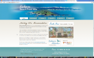
An example of a simple, easy to find menu structure.
2. Content
Content must be clear and easy to read. Nothing creates a bad first impression more than lots of spelling errors, badly laid out content and content that doesn’t come to the point.
- Break up content with headers, sub headers and bullet points
- Use concise paragraphs and sentences
- Be relevant. Don’t add content that has nothing to do with your business.
- 100% accuracy when it comes to spelling and grammar is a must. If spelling is not your thing then get someone else to proof read your content (as long as they are a good speller of course!). One of my frustrations is seeing the incorrect use of the words ‘complimentary’ and ‘complementary’. They do not mean the same thing! If I see this I immediately switch off from the site. If I am how many other people will be?
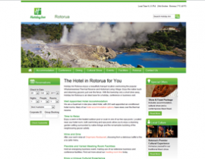
The Holiday Inn Rotorua website has clear headings and sub-headings with short paragraphs.
3. Auto-Play
Sound should be started by an action initiated by the user rather than requiring that the sound be stopped by the user. Have you ever entered a website that has a video or music auto -laying and you then find yourself frantically trying to stop it?
- Make sure that videos have an obvious play button so users can choose whether to watch it or not.
- Never have music playing in the background. Apart from being so ‘not now’ it is very distracting.
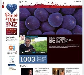
The video on the Pinot Noir NZ site is prominent on the home page instead of auto-playing.
You know it is there and can choose to play it.
4. Animation
Anything that moves on your website is potentially very distracting.
- If you want users to sign up for a newsletter or register for a seminar don’t have a form pop up covering the content they are reading. Instead, opt for very clear calls to action on the page that makes is obvious that there is a seminar or a newsletter that needs you to register for.
- Blinking content is very distracting and makes it very hard for users to read content on that page.
- If there is a compelling case for having animation on your site it ideally should not play for longer than 5 seconds
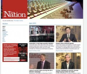
The Nation website encourages people to enter their weekly competition. This clearly stands out on the page.
5. Advertising
Your website should predominantly be promoting your business not the business of others.
- Advertising that shows above the fold i.e. the top part of your website potentially says to your visitor that you are more interested in selling the services of other companies rather than your own. Importantly, it makes it difficult for visitors to see your own content as they probably need to scroll down to find it.
- If you do have to advertise then make sure the advertising is relevant to your business i.e. offering a complementary product.
- No animated or flashing advertising banners!
By all means advertise a seminar you are running or a book you have just written but don’t promote other companies products or services above yours.
6. Look and Feel
Of course the look and feel of your website is also very critical to the impression it is giving to users.
- A design that is cluttered makes it hard for your visitors to find what they are looking for. Don’t be afraid of white space!
- The wrong text to background contrast can be very off-putting and difficult to read. Grey text on a black background initially look good but it is difficult to distinguish the words from the background. See the example below:

- Inconsistent styling is also quite off-putting. This is where you have a mix of font styles, sizes and colours. For example if your link colour is red then all of your links should be red, if your page name is a blue, sans-serif font then all of your page names should be a blue, sans-serif font.
- Visually appealing websites have a consistent, complementary colour scheme. Colour is a perfect way of identifying, grouping or differentiating certain elements of your website. For example, it can be used to make your main calls to action stand out so that they are easily seen by your visitor e.g. your Enquiry button or your Book Now button. Please note though that too much colour can be as off-putting as too little colour!
We all know that it takes less than a second to create a first impression. Chances are that by making a few small fixes to your website, you’ll be well on your way to making sure your first impression is a great one.
If you are keen to read further about how to improve your website I suggest the following articles/websites:
http://www.uxbooth.com/topics/articles/visual-design/
http://conversionxl.com/first-impressions-matter-the-importance-of-great-visual-design/
What changes have you already made to your website that improved your visitors’ experience?

Related posts

- March 2024: Google algorithm update - A crackdown on low-quality AI generated content
- GA4 - Where to Start?
- Compulsory shift to Responsive Search Ads coming in June
- What are Google Ads keyword match types and how are they changing?
- How do I get my business to show up on Google? Part 3: Google Shopping Ads